By Katie Azevedo, M.Ed.
Giving class presentations is just part of the school experience. Some students dread presenting to their classmates, and others prefer class presentations to written assessments. If you’re new to this, or if you’re just looking for some ideas, I share my best class presentation tips for students in the post below.
Class presentations often involve a visual component, and an audio and delivery component. The tips in this post are for class presentations that involve SLIDES, such as Google Slides or PowerPoint. Therefore, I break down the class presentation tips for students into the following categories:
- Visual class presentation tips:
- format
- text and content
- images
- Audio and delivery class presentation tips
- Bonus class presentation tips to up-level your game
Class presentation tips for VISUALS
The following tips will enhance the visual component of your school presentation. The strategies are further categorized by format, text, and images.
Class presentation tips for slide FORMAT
The visual format of your presentation must be clear and easy to read.
1. Use a slide deck.
This class presentation tip is obvious, but I can’t leave it off the list. If you’re presenting to your fellow students, you will need some kind of visual representation of the information you’re delivering. Very rarely will you present to your class without slides. Google Slides and PowerPoint are the two primary products to make slides.
2. Use the right number of slides.
Class presentations in high school and college will likely be 5 minutes or less. Follow your teacher’s guidelines, of course, but generally, students will use 1-2 slides per minute. (That would be 5-10 slides for a 5-minute presentation.)
3. Use an appropriate slide template and theme.
PowerPoint and Google Slides come with default slide templates (themes). Most of the default templates are suitable for class presentations, and so you should be fine choosing one of those. You can also find templates on the free version of Canva. I like slidesgo.com for free templates (it’s not sketchy – I’ve personally used it. I also like SlidesCarnival.com but you have to import the templates into Canva first, and then export them from Canva into Google Slides or PowerPoint.
4. Use clear fonts.
Pick your font based on clarity, not creativity. Your audience should be able to read your text effortlessly and from the back of the classroom. Here are some rules:
- Avoid cursive / script fonts
- Avoid writing in all capital letters
- Avoid fonts that are entirely in italics (slanted)
5. Use a maximum of two fonts.
Stick to two fonts: one for headings and titles, and one for body text. More than two fonts make your slides hard to read.
6. Use 3-4 colors.
Stick to a basic color palette of no more than four colors. It’s fine to use images that are outside your color scheme, but besides images, avoid too many colors. Most default templates stick to four colors or less, so you’re safe if you use a pre-made template.
7. Use high-contrast text-on-background combinations.
Your text needs to stand out from the background color. Black font on a white background or white font on a black background provides the highest contrast and best readability. This website here provides excellent information and examples about color combinations.
Class presentation tips for slide TEXT and CONTENT
8. Start with a simple title slide.
Your teacher will likely require a title slide in the syllabus. Even if it’s not required, make one anyway. A title slide should be simple: the name of the presentation, your name, and a simple graphic or image.
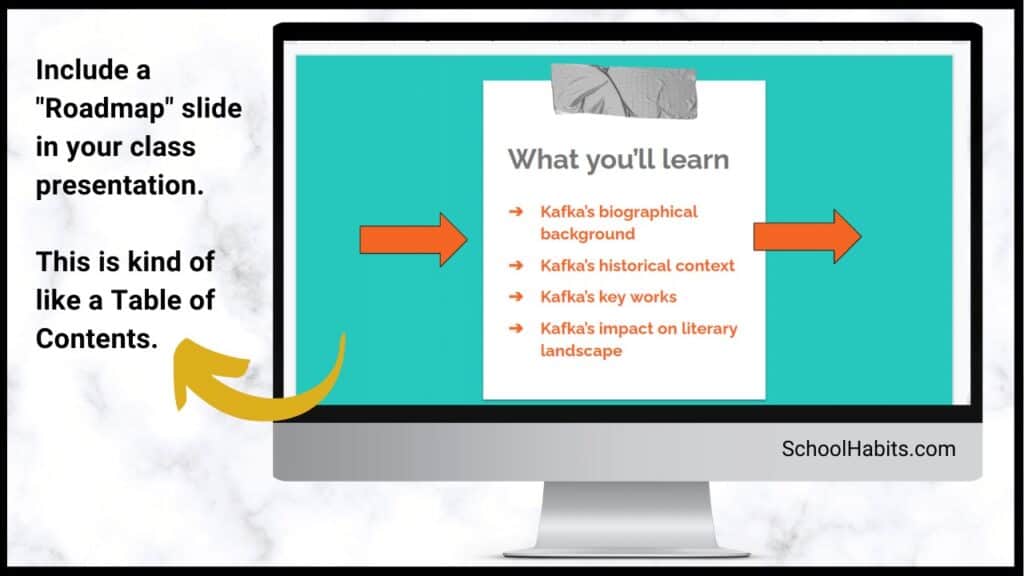
9. Include a roadmap slide.
A roadmap slide (I made up that term, but it works) is like a table of contents. It tells your classmates what they will learn from your presentation. Even if your presentation is only 6 slides long, a roadmap slide can be helpful. Below is an example.

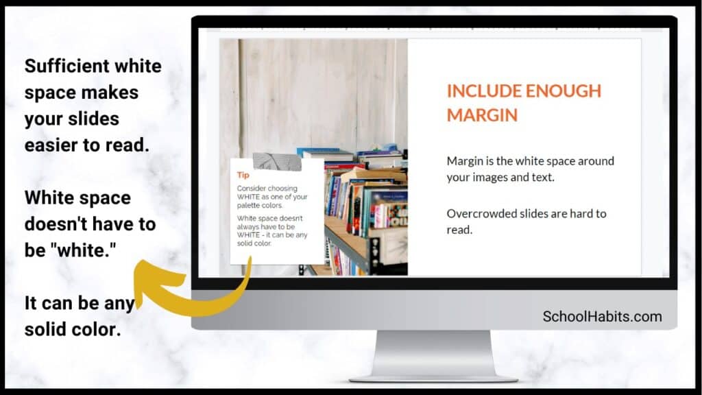
10. Include enough white space.
White space is the blank space that doesn’t contain text or images. White space is very important for readability. In the image below, you can see the impact white space has on readability.

11. Use bullet points.
Whenever possible, use bullet points instead of complete sentences. Most slides should include no more than 5-6 bullet points. If you need to say more, continue the bullet points on another slide.
12. Leave some text off the slides.
Your slides should include minimal to moderate text that you will elaborate on during your class presentation. In other words, don’t cram the slides full of everything you want to share on the topic. The only exception to this rule is if you are not verbally presenting to the class, but are instead just sharing the slides with your classmates to view on their own.
13. Include examples.
Examples make most things clearer. When possible, include an example for all your main points.
14. Include statistics and other quantitative information.
Use numbers in place of text when you can. Numbers and statistics can be easier for your audience to process. Example below:
- Instead of saying this: There is one-third as many Giant Pandas living in 2020 as there were in 2014.
- Say this: Giant Panda population in 2140 = 1864 | Giant Panda population in 2020 = 600 [source]
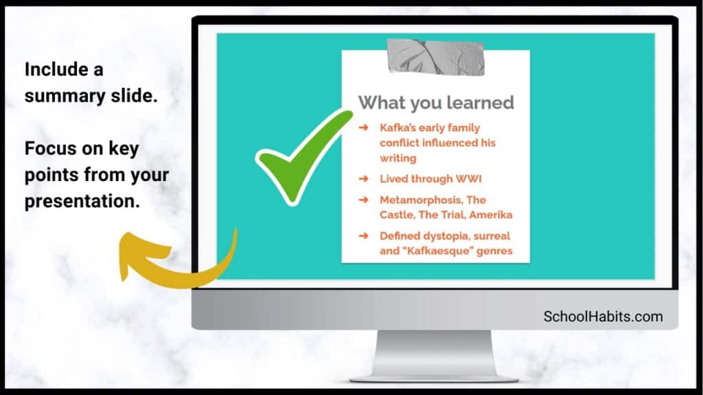
15. Include a summary slide
Consider adding a final summary slide to your class presentation. This is an excellent strategy because it will increase your audience’s understanding of your main points. The text on this slide should be in bullet-point format. The information on this slide might align with the information on your roadmap slide.

Class presentation tips for slide IMAGES
16. Include an image or graphical element on each slide.
Every slide should have some kind of graphical element to complement the text. Some slides might even have an image and no text. (You would explain the image in your verbal presentation to the class.) Note: be sure to cite all images.
17. Use images / graphics for illustration and emphasis, not decoration.
Avoid using images for decoration. Images and graphics should do one of the following:
- Add something valuable to the text
- Illustrate the idea on the slide
- Represent the idea on the slide
- Emphasize an element of the slide (such as underlines, stars, etc.)
18. Resize and reformat images.
Resize images and graphics to fit the scale of your slide. It should be big enough to see clearly, but still allow for plenty of white space (Class Presentation Tip #10). You can remove the background of an image using a mobile app, or something like the paid version of Canva or PicMonkey. Again, be sure to cite your images.
19. Use video when appropriate.
If your presentation calls for it, include short video clips. Only use video if it adds value.
20. Use icons for emphasis.
Use icons like stars, 3D shapes, speech bubbles, and arrows to emphasize important text. Keep these icons within your color scheme. You can find free icons within Google Slides and PowerPoint, or you can use Google Images or Canva.
21. Use graphs and charts.
Too much text is confusing. Too many images is boring. Solve this problem by using pie charts, bar graphs and other graphical ways of representing data.
Class presentation tips for SPEAKING
You might have the best slides in the class, but your presentation is not complete until you deliver it to your classmates. The following tips are for improving your audio and delivery.
22. Never read directly from the slides.
Use the slides as a reference, but don’t read word-for-word. How do you do this? First change to the next slide. Then look at it for cues. Next, speak directly to your classmates, making eye contact as your speak. It’s okay to glance back at the slide if you need to.
23. Face your audience.
Your body should always face the audience. Stand or sit either straight on, or at a 45-degree angle. Never have your body square to the presentation screen.
24. Explain the images.
When you present each slide, you should spend some time on the text and some time on the images. If your images add value (which they should), then this should be simple to do.
25. Speak slowly and clearly.
Speak slower than you naturally speak. Practice difficult words until they are smooth.
26. Use verbal transitions between topics.
When you change topics, use transition expressions such as “Next, we are going to look at …” or “Now, let’s move on to …”
27. Practice more than you want to.
Practicing your class presentation over and over improves your delivery and increases your confidence. Practice in front of the mirror, in front of others, or in front of your camera (to be watched later, of course).
Bonus class presentation tips for students: How to up-level your game
The following bonus tips are for students looking to take their class presentations to the next level. Keep in mind that some of the ideas below are best suited for college and university students.
28. Provide a printed note-catcher.
An engaged audience is the best audience. To increase your classmates’ active focus, provide each student a printed note-catcher they can use to follow along with your presentation. PowerPoint and Google Slides both have features that enable you to print out your presentation with the slides on the left and space to take notes on the right.
29. Ask questions and survey your classmates.
Another way to engage your audience is by asking them questions. You can build these questions into the slides themselves, or you can pause your presentation to ask questions before moving to a slide with the answers.
30. Use the Speaker Notes section.
The text on your slides should vary from the words you speak to your classmates during your presentation. Either you practice your presentation so much that you memorize it, or you use the Speaker Notes section on PowerPoint or Google Slides.
31. Open with a question, and close with an answer.
A great class presentation tip for students is to open with a question you pose to your classmates at the beginning, and then close with the answer. You could put the question on its own opening slide and then close with another slide that re-poses the question and features the answer.
For example, if you are presenting on Susan B. Anthony, your question could be Who was Susan B. Anthony? and the answer – which is the point of your presentation – could be Susan B. Anthony was one of America’s greatest champions for freedom and equality of women and slaves. College-level presentations would have more complex question-and-answer pairings than this example, but you get the idea.
Class presentation tips for students – summary notes
It’s important to follow your teacher’s requirements when creating your class presentation. Use these tips and strategies to maximize your grade, impression on the class, and your content delivery – but always consult your syllabus first.
And finally, the greatest tip of all is to PRACTICE. In Tip #27 I emphasize the importance of practicing more than you want to. Watch TED talks and other notable speakers to see how smooth they speak – these presenters have practiced the same presentation hundreds of times. Practice is the key.

